Dashboard and Stats Refresh
T.LY analytics recently got a cleaner dashboard and stats page.
This update was not just about making the screens look newer. The goal was to make link performance easier to understand when you have a real campaign running and only a few minutes to answer the obvious questions:
- How many people clicked or scanned?
- Where did the traffic come from?
- Which devices, browsers, countries, and referrers matter?
- Did the QR code campaign work?
- Is there a trend worth acting on?
Good analytics should help you move from "here is a pile of data" to "here is what changed, and here is what to do next." That is what this redesign is focused on.
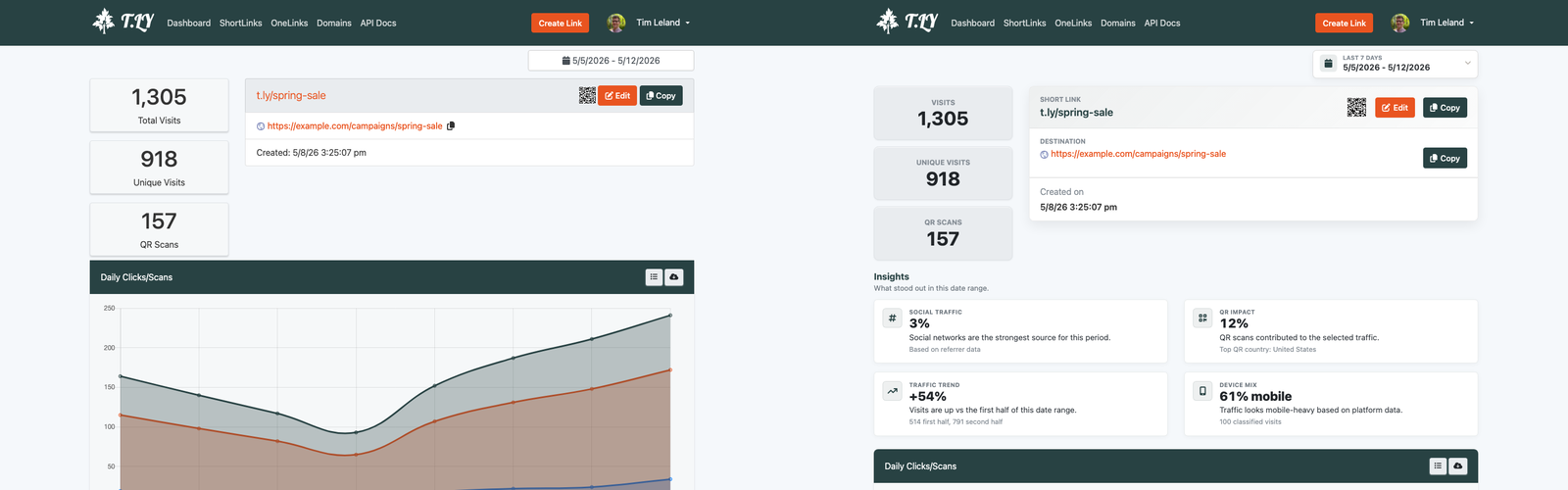
The stats page before and after
The old stats page showed useful data, but too much of it required scanning separate boxes and interpreting small circular charts. The new page puts the core story higher on the page: total clicks, QR activity, traffic over time, locations, browsers, platforms, and other breakdowns are easier to read at a glance.
The stats page is where you go when you care about one specific short link or QR code. That page needs to answer two jobs quickly:
- What happened with this link?
- Where should I look next?
The refreshed layout makes those answers easier to find. The headline metrics are clearer, the trend chart is more useful, and the supporting breakdowns are easier to compare without decoding a cluster of tiny slices.
That matters for QR campaigns because printed campaigns are often judged by placement. If a flyer, menu, mailer, event sign, or package insert uses a T.LY short link or QR code, the stats page should make the result obvious without forcing you to export a spreadsheet.
The dashboard before and after
The dashboard has a different job. Instead of focusing on one link, it should help you understand overall account activity.
The new dashboard makes the main metrics easier to scan and gives the page a stronger visual hierarchy. The most important numbers sit where they are easiest to find. Supporting details are still available, but they no longer compete with every other section for attention.
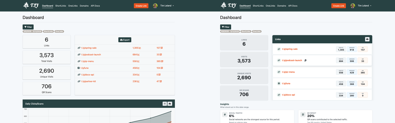
That follows a simple dashboard principle: the page should be designed around the decision the user is trying to make. Tableau's dashboard guidance puts it well: dashboards should have a clear purpose and work for the intended audience, and adding too many views can cause the big picture to get lost in the details.
For T.LY, the audience is usually a marketer, founder, developer, or operations person trying to understand link performance fast. They may not be doing a formal analytics deep dive. They may just need to know whether yesterday's campaign, QR code, social post, or email link is performing.
The redesign makes that easier by emphasizing:
- Summary metrics before secondary details
- Trends over isolated numbers
- Readable lists for category breakdowns
- Clearer spacing between sections
- Cleaner chart areas
- Faster comparison between traffic sources and devices
Why the old pie charts had to go
Pie charts are familiar, but familiarity does not always mean usefulness.
They can work when you have a small number of categories and one slice clearly dominates the others. But analytics dashboards often have the opposite problem: many categories with similar values. Referrers, browsers, platforms, countries, and languages are not always clean "one huge slice and two tiny slices" datasets.
That is where pie charts start to break down.
Tableau's own guide notes that reading a pie chart requires comparing slice areas, arc lengths, and angles. It also warns that pie charts do not work well when there are too many categories or when similar percentages exist between values.
Atlassian's data visualization guide makes the same point from another angle: exact proportions are difficult to read in pie charts except for obvious fractions like 50%, 33%, or 25%. It also notes that bar charts usually communicate the same point more compactly and clearly.
That is the main reason the updated dashboard leans more heavily on readable breakdowns rather than pie-heavy sections.
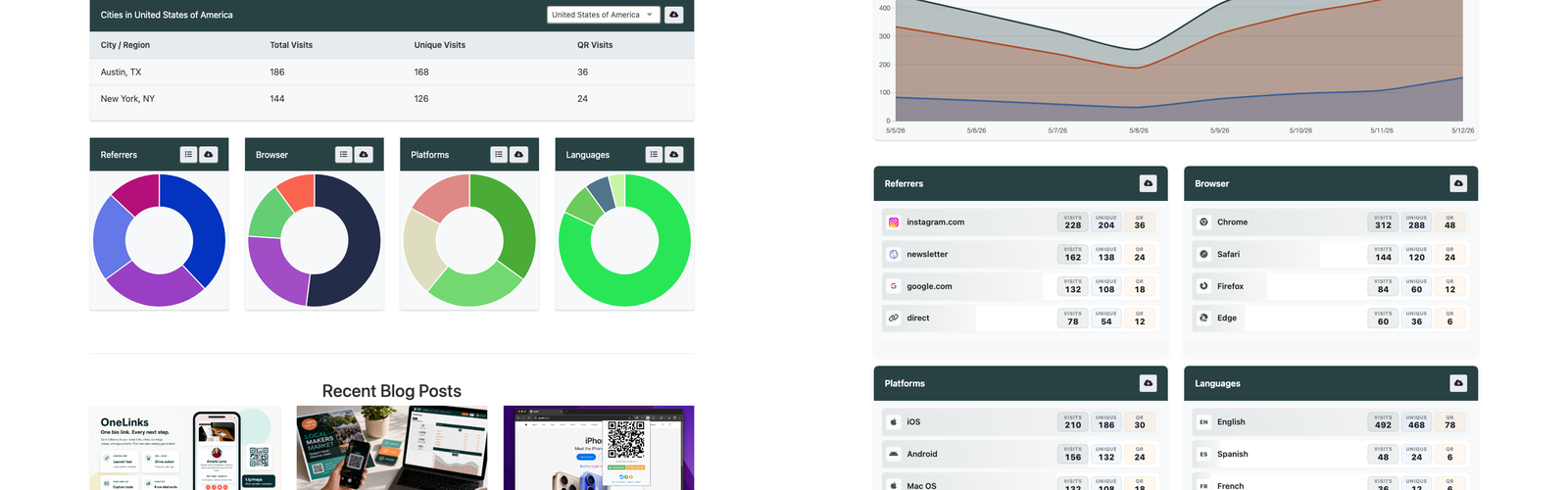
In the old dashboard, a group of circular charts could look colorful, but the practical question was harder:
- Which browser is actually first?
- How close is second place?
- Are mobile and desktop meaningfully different?
- Which referrer deserves attention?
- Which language or platform is large enough to matter?
When those answers live in pie slices, you have to compare angles and colors. When they live in ordered lists or cleaner breakdowns, you can scan rank, label, and value together.
That is a better fit for link analytics.
Better analytics are not just prettier analytics
A cleaner analytics page should do more than reduce clutter. It should reduce the amount of thinking required before you can take action.
For short links and QR codes, that usually means making these patterns easier to see:
- A QR code is getting scans, but the landing page is not converting.
- A social post is driving clicks from one referrer more than expected.
- Mobile traffic is dominating, so the destination page needs to be tested on phones first.
- A campaign is getting attention in a country or city you did not expect.
- A link keeps getting traffic after the original campaign ended.
- A browser, platform, or device type may need QA before launch.
The new T.LY dashboard and stats page are designed around those kinds of questions. The old interface had the data. The new interface makes the data easier to read.
What changed in practice
The update improves the analytics experience in a few practical ways.
First, the most important metrics are easier to spot. You should not have to hunt for total clicks, QR scans, or recent activity.
Second, trend data is more prominent. A total number is useful, but a trend tells you whether the campaign is rising, falling, or spiking because of a launch, email, event, or social post.
Third, the supporting breakdowns are easier to compare. Referrers, browsers, platforms, countries, and languages are more useful when they can be scanned as ranked insights instead of interpreted as chart decoration.
Fourth, the dashboard feels calmer. That sounds cosmetic, but it is not. Spacing, hierarchy, and chart choice all affect whether someone can understand a page quickly.
Finally, the stats page is better aligned with how people use T.LY today. A short link is often more than a redirect. It may be part of a QR campaign, a branded domain strategy, an email launch, a social post, or a printed campaign. The analytics page needs to support that bigger job.
When pie charts still make sense
This is not a rule that pie charts can never exist.
They can be useful when:
- The data represents one complete whole
- There are only two to five categories
- One category is obviously larger
- Exact comparison is not the main job
- The chart is supporting another visualization instead of carrying the whole dashboard
But for most link analytics questions, you are comparing categories. You want rank, magnitude, and change. That is why tables, lists, line charts, bar-style breakdowns, and clear summary metrics usually do the job better.
The bigger direction for T.LY analytics
This redesign is part of a broader direction for T.LY: to make campaign analytics faster to understand without sacrificing details.
Short links and QR codes are often used in places where the campaign is already moving: social posts, printed flyers, direct mail, packaging, events, email, ads, and internal tools. Analytics need to keep up with that pace.
The refreshed dashboard and stats page are a step toward that:
- faster scanning
- clearer insights
- better QR campaign reporting
- cleaner traffic breakdowns
- less chart noise
- more useful comparisons
If you are using T.LY for short links, QR codes, or branded links, open your dashboard and stats pages to see the new layout.
The goal is simple: spend less time decoding analytics and more time acting on what they tell you.
Related Posts


Tim Leland
Useful Tools
Ready to improve how you manage links?
T.LY URL Shortener makes long links look cleaner and easier to share! Add your own Custom Domains to personalize your brand. Create Smart Links to customize a URL's destination. Generate QR codes to promote your business.
Sign Up for Free